Step 01
Mapping the user flow
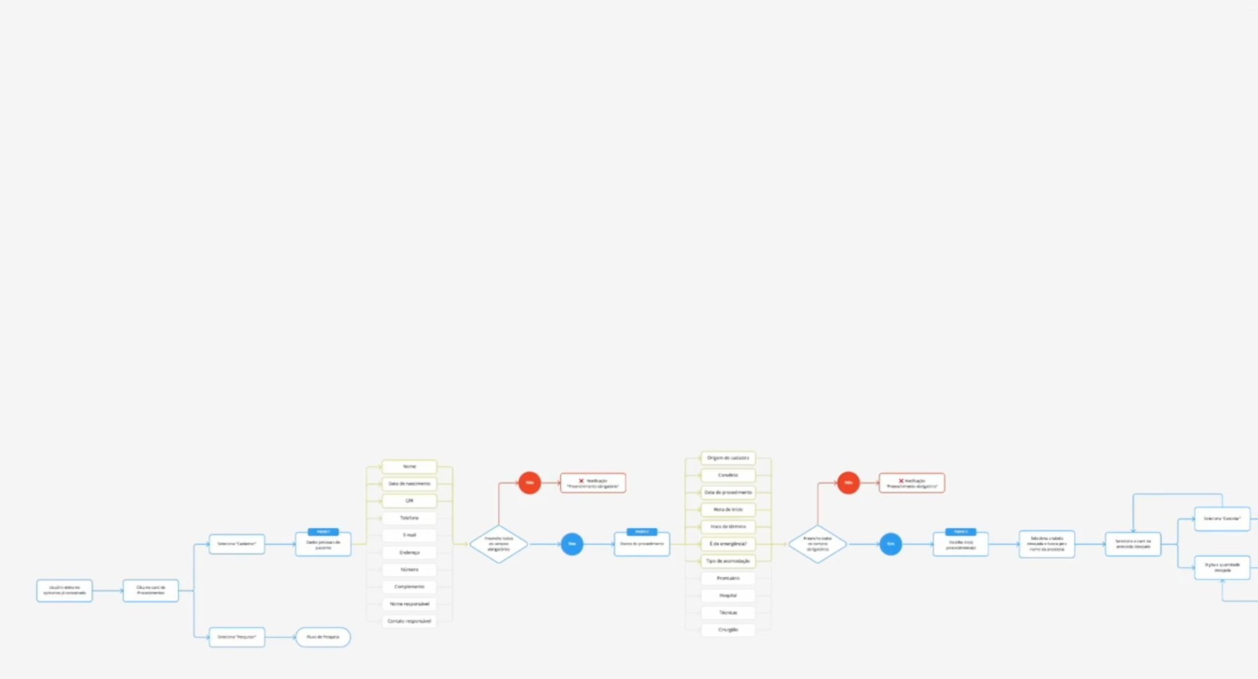
To understand the fee calculation, we mapped the user journey to find each decision point and input field. This gave the back end what it needed to automate the calculation.
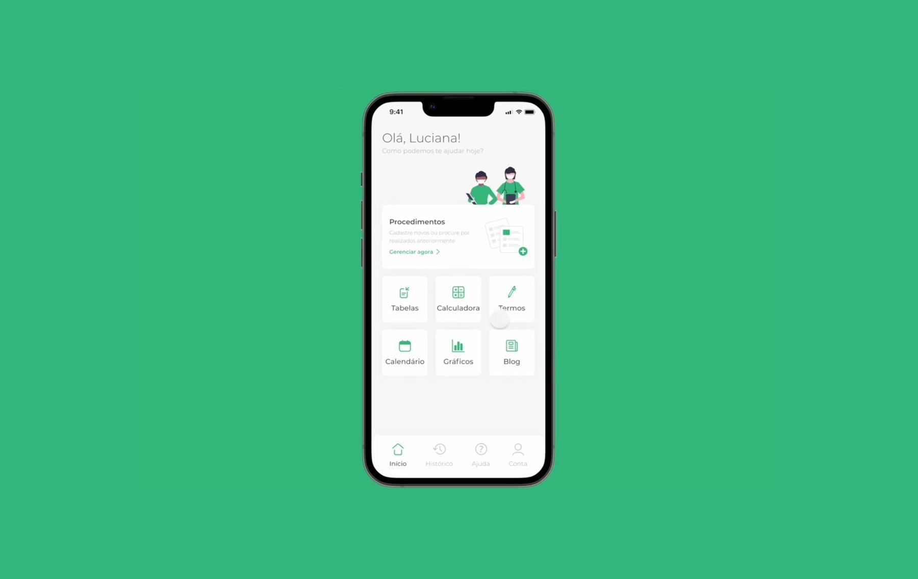
End-to-end process, from market research and an MVP to a redesign driven by usability testing. The app turns the stacked billing rules anesthesiologists deal with every day into one guided fee calculation.
Anesthesiology is the fifth largest medical specialty in Brazil. In our 2020 survey, with more than 550 responses, over half of these doctors said they don't understand, or only partly understand, how their procedures are priced. Out of 25,500 anesthesiologists, almost 10,000 don't know how to charge for their work.
Without that clarity, manual accounting leads to frequent miscalculations. And with heavy workloads and many patients a day, doctors need one place to manage it all.
The final fee depends on the procedure's duration, the patient's age, gender and weight, and on how many anesthesia codes were used. Doctors had to run these four rules by hand, for every surgery:
Each anesthesia has a classification from 0 to 8. The higher the number, the higher the fee.
Take 100% of the anesthesia with the highest classification, then add 50% of each other one at the same incision site, or 70% at a different site.
The total doubles for a child under 2.5 kg or a procedure in a private room.
Classification 7 or 8, extracorporeal circulation, neonatal surgery, gastroplasty, surgeries over 6 hours, or emergencies at night, on Sundays and holidays.
I led the work end to end, from market and user research to the final screens and the hand-off to the developer.
To understand the fee calculation, we mapped the user journey to find each decision point and input field. This gave the back end what it needed to automate the calculation.
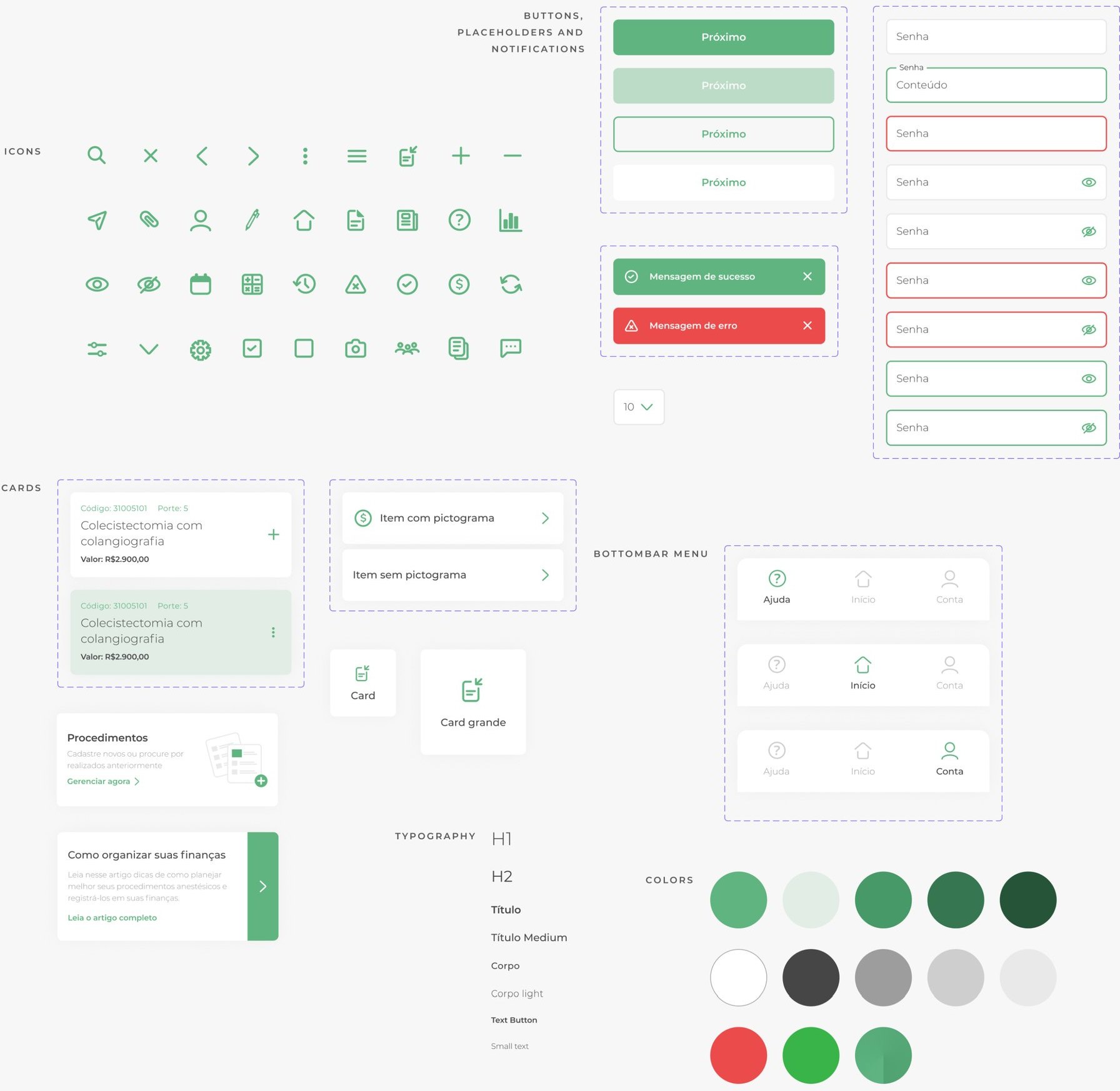
After a few low-fidelity sketches, I built a style guide with icons, colors and typography so the MVP could be developed fast and stay consistent.
The first version used pop-ups to add, edit or remove anesthesias, which piled up as tags under the search. At the end, the app showed the suggested fee for the surgery.
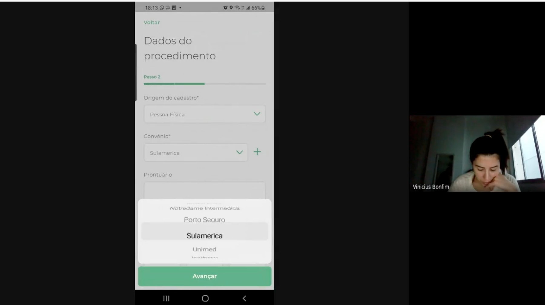
With the MVP in production, we ran remote, semi-structured usability tests. Five sessions were enough to reach saturation: the same patterns kept coming back.
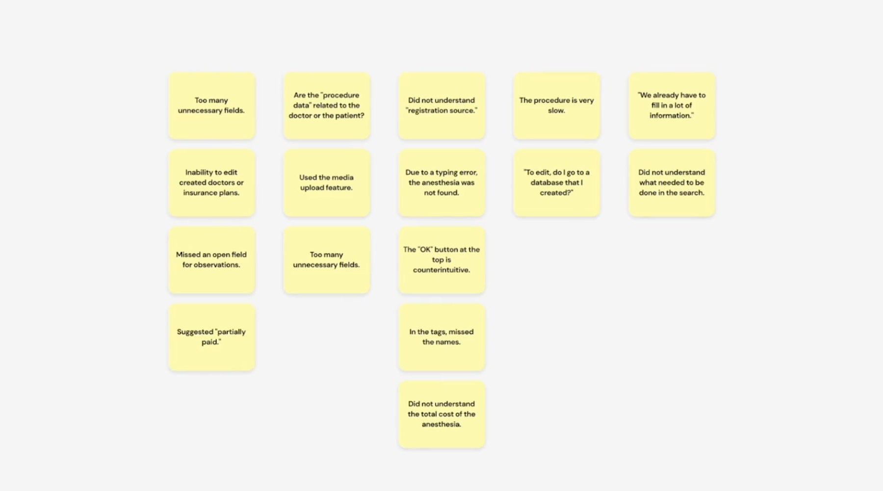
I grouped every observation by semantic similarity. Clear patterns and outliers showed where the product was slowing doctors down.
Most users complained about the number of mandatory fields when registering and logging procedures. It slowed them down a lot.
Many users were confused by unclear instructions and ambiguous interface copy.
Users often missed that their selected anesthetics showed up as tags under the search bar, which created doubt mid-task.
A very lean team: me and two developers, one front end and one back end. It was a side project for everyone, so we met outside the hours of our full-time jobs.
A tight budget. The app was idealized by an anesthesiologist, together with a partnership she secured with Coopanest, the cooperative of anesthesiologists in Rio de Janeiro.
Most users were older doctors with very little familiarity with tech language. In healthcare, that language barrier was a constant challenge.
To fix the issues the tests surfaced, we proposed a functional and visual redesign of the registration flow.
A toggle shows only the fields each step needs. Less clutter on screen and less to think about, so doctors focus on what matters for that procedure.
The form went from 25 required fields to 8, a 68% cut. Optional info like phone or e-mail moved behind an "Add more fields" button, and tighter spacing (16px to 12px) cut down scrolling.
Modals interrupted a critical task with too many buttons and choices. Bottom sheets keep the context on screen, so the selection flows without abrupt breaks.

“He led everything from market and user research to the delivery of the final screens.”
I worked with Gabriel on developing the AnestPlan app, where he led everything from market and user research to the delivery of the final screens and coordination with the developer. It was a great experience! In addition to being very skilled technically, he is always thinking about new applications and is very dedicated. I look forward to working with him again soon!
Coopanest wanted as much data as possible from every doctor. I had to show that more form fields mean more time in the app: more pixels, more screen, more scrolling. Usability tests backed it up, since users kept complaining about the long registration. Advocating for user-centered design meant finding a middle ground: required fields only for what mattered, with flexible space for optional ones.
Pop-ups aren't forbidden. But over the years they picked up a bad reputation for ads and interruptions. Swapping them for bottom sheets gave the interface more flexibility, and matches the swipe gestures people already use every day on iOS and Android, like pulling down the control center to change volume or brightness.
With an agile pace and a small budget, usability testing is what validates the solutions. So is staying close to the developers, to compare the screens in production with what we designed in Figma.
I use Microsoft Clarity to see how people move through this site, so I can keep improving it. It only sets cookies if you say yes.
Current choice: